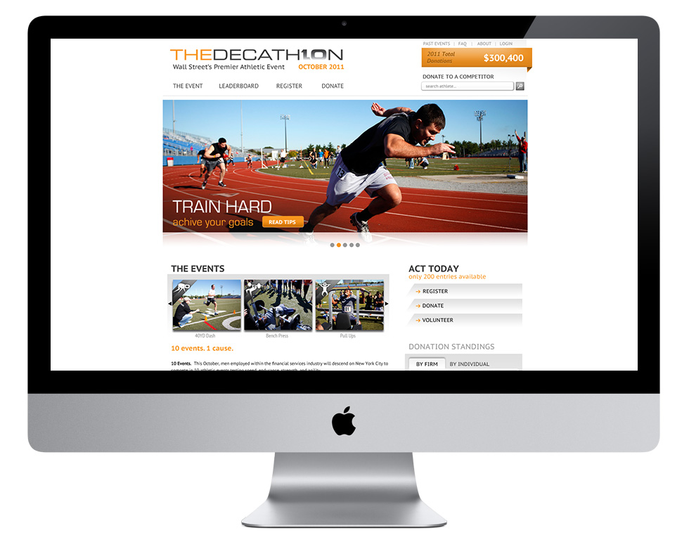
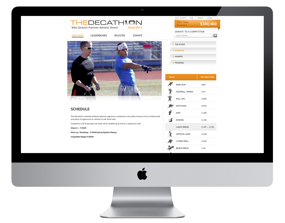
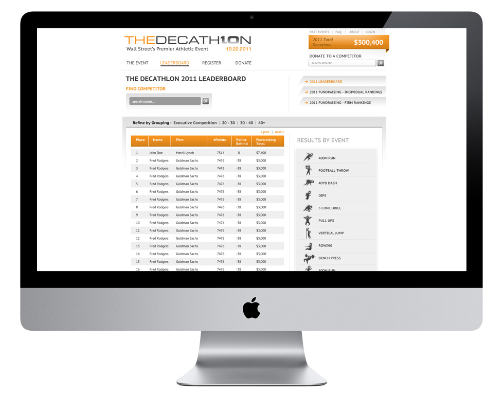
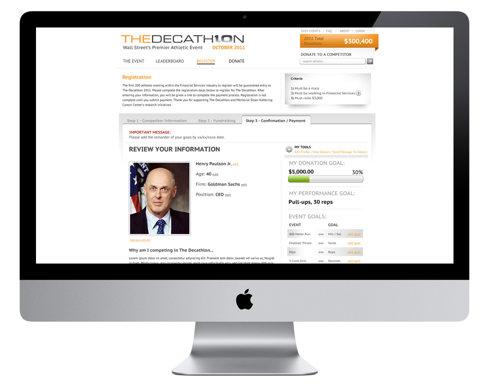
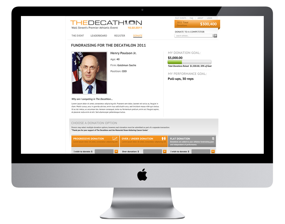
Wall Street’s premier athletic event. The Decathlon’s participants take the athletic and fund raising challenge very seriously, matching the founder’s passion for athletic competition and performance-based fundraising. This year’s goal was to raise $500,000 to benefit Memorial Sloan-Kettering Cancer Center. Participants compete in ten athletic competitions, setting a performance goal for their featured event, which determines individual donations.
The first two years were sponsored and benefitted the Lance Armstong Foundation. Due to negative press, around alleged doping, the founders decided to benefit the Memorial-Sloan Kettering foundation. Losing the marketing muscle of Nike would require much more in-house work to meet the donation goals.
Realizing in late 2010 there was backlash against the financial industry, we had an opportunity to give Wall Street a means to receive positive PR. Getting executive level participation would help overall corporate donations as well as trickle down to individual professionals. The financial industry is very competitive and we wanted to foster that competitive drive. We had 3 months to get a new site up and running to start driving registration
First we decided to start from scratch for the website and evolve the identity. I wanted to change the previous “heavy” feel to a bright open design utilizing previous years photography to create a dramatic contrast. I wanted to create a set of icons that complimented the new logo, taking cues from the athletes, creating an identity that participants would feel they were participating in a top level athletic competition. For development we chose Wordpress as the backbone to jump start programming and reduce upfront costs, although most of the site was going to require all new functionality and heavy customization.
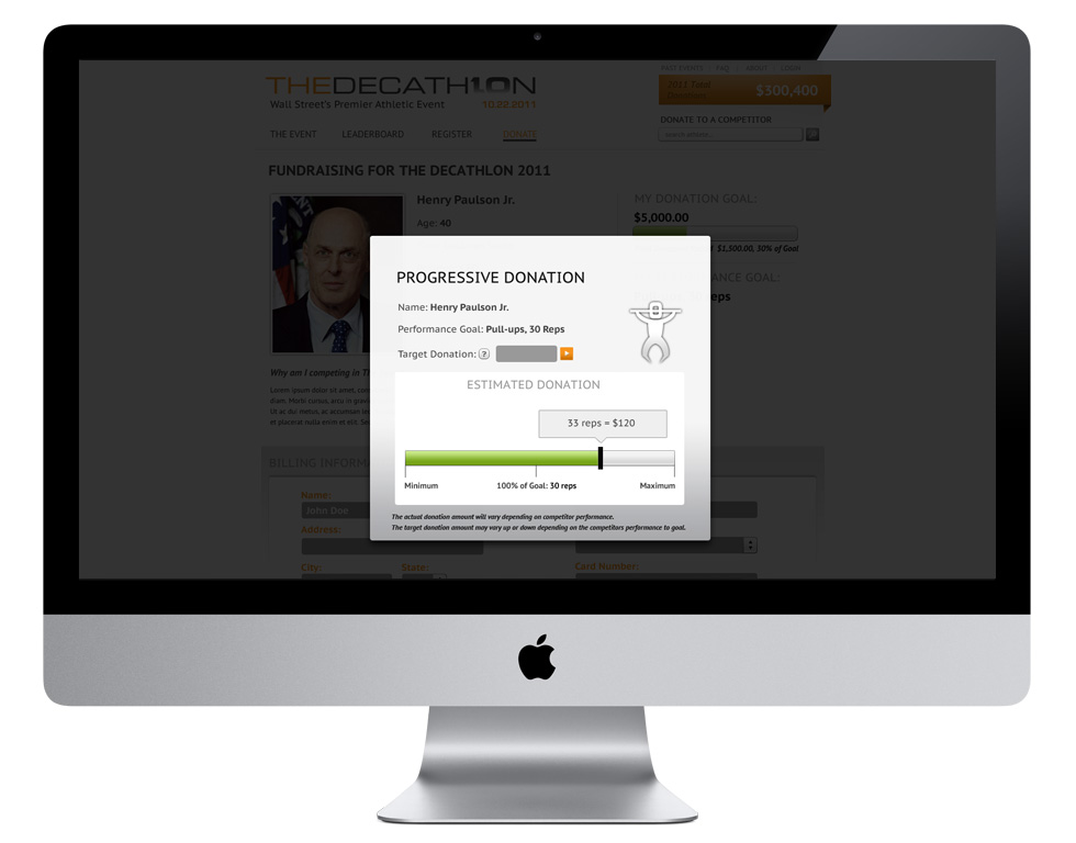
The first 3 months the site went live with only one goal, to drive registrations. We made registering an easy and fun multistep wizard. After registration was closed, we rolled out the donation portion of the site. Sponsors were incorporated, from giveaways to workout plans developed by Equinox. This was the first year that there were betting donations involved, over/under and sliding scale. New tools were developed to show potential donation limits. To foster executive competition we decided to have multiple age groupings, with winners in each and an exclusive the Executive level. Each group would have top overall athlete, top event athlete and top fund raiser. To foster competition among the firms we decided to have matchup bets of firm against firm and inter-firm rivalries. And for prospective donators we created a featured stories list to increase non-participant related donations. This would lead to top company event winners and fundraising bragging rights.
For marketing we branded Twitter and Facebook, utilizing API’s on the website. Several Flash and static banners were designed to drive both registration and placed on financial related websites.
Each main phase of the site was launched on time. The Decathlon met it’s registration quota and through the 3 months of donations and the day of the event was able to raise $499,244.00, less than a thousand dollars from it’s goal. Under Armor supplied Decathlon branded shirts, hats and shorts, the site was featured on Bloomberg news, the result was more publicity and twice the fundraising than the previous year. We ended the project with a post-event website and a project I can be proud to have been a key participant.
Website:
www.thedecathlon.org
Agency:
Wowza Technologies / DeepBlue
Role:
Creative Direction, Identity Design, Information Architecture, Website Design, HTML/CSS /jQuery Prototyping and Template and Standards Development, Project Management
Timeframe: 8 months
One of my goals was to have custom branded elements that we could carryout through the website and other marketing collateral. Drawing inspiration from official Decathlon and Olympics event iconography and visually matching the 0 in our logo design, we came up with a little competitor character that could be posed for each event icon giving each a very in-motion feel.
And yes, I'm only showing 9 of them... I didn't like the basketball icon so much.
cases studies: The Tennessee Aquarium | General Tire | The Decathlon
Reveal makes these very easy to summon and dismiss. The close button is simple an anchor with a unicode
character icon and a class of close-reveal-modal. Clicking anywhere outside the modal will
also dismiss it.